Part II — From Physical to Digital · Chapter 07
An interface takes shape within the limits of materials, processes, device, context, business and person. Designing means recognizing those limits, measuring them, and deciding who absorbs the effort when we exceed them.
When you work in industrial design, you soon discover that a user’s interaction with a product begins before the object exists. It begins with knowing which materials you can source, which machine you will produce on, and which mold you can afford. Many of the sensations we later credit to design are decided there: how firm or soft a grip feels, where one part ends and another begins, what it costs to repeat the object ten thousand times.
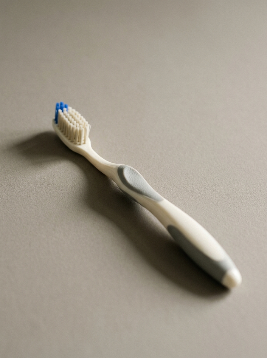
A toothbrush shows that whole journey, because it is an everyday contact between hand, material and body. Almost nobody thinks about its mold, and yet every manufacturing decision reaches the mouth of the person using it. I use it as an example of something anyone can check against the object in their own bathroom.
The question I want to carry from there into the digital world is simple. First: what can we make? Then: how can someone use it? And finally, the one that weighs most once the product is in a person’s hands: what are we demanding of them when they use it every day? Chapter 5 introduced digital materials and Chapter 6 their preservation over the life of a product;6 this one examines how those decisions reach the person through the interface.
Part II — From Physical to Digital · Chapter 07 · 01 Material and process

Consider a toothbrush made of a rigid body and softer grip zones. That combination is not decided on the drawing alone. Multi-component injection, the mold and the compatibility between materials shape its geometry, its joints and its surface: where the soft part can end, what thickness it allows, how it bonds to the body and what texture remains visible. The machine bounds what is possible; the design team still makes decisions inside those bounds.
It helps to separate that body from what happens with the filaments. The documentation from ZAHORANSKY, a manufacturer of brush-making machinery, distinguishes the injection of one- or multi-component parts from the placement of the filaments and their finishing, which includes trimming and rounding the tips.1 They are different processes and each one delivers different decisions: the first defines the grip and the shape; the others define what touches gum and enamel. Knowing which one a decision belongs to keeps us from blaming the mold for what is the filament’s, and the filament for what is the mold’s.
The same goes for hard, medium and soft bristles. The commercial categories are useful for talking about perception, but the real response depends on a combination of material, diameter, length and arrangement of the filaments. Two brushes that both say “medium” can feel different. I am not comparing specific brushes here; I use the categories only to show that a sensation is the consequence of several variables at once.
To follow the argument it helps to fix three words with a simple meaning. They resemble one another, which is why they get confused.
Table 7.1 — Three terms that are not synonyms
| Term | What it means in this chapter | In the toothbrush |
|---|---|---|
| Constraint | A condition that bounds a decision, such as the available process, the space of a room or the budget | The mold you can afford and the materials that are compatible with each other |
| Technical tolerance | Permitted variation from a specification, for example in a dimension or in the fit between parts | The admissible variation in a wall’s thickness or in the fit between the body and the soft zone |
| Acceptance threshold | The limit of an admissible response, such as actuation effort, the intensity of an alert or the duration of a task | How much firmness the user tolerates before it becomes bothersome |
This chapter borrows the idea of tolerance from manufacturing and extends it to interaction design. The availability of a material is a constraint; its properties and permitted variations help establish its operating margin. People also show differences and limits that must be studied. That extension is an editorial proposal of this chapter: they are not technical synonyms and I do not use them as if they were.
Let us push the logic to the extreme. With the right machinery and materials it is possible to manufacture a toothbrush with metal bristles. Nothing in the process prevents it. And yet being able to make it does not show that the combination is appropriate for the intended contact: that a way to produce something exists does not answer whether it should exist. This is the point at which the possibility of production stops being enough to justify a design.
The user feels the consequence of these decisions every time they pick up the object and use it. In an application something similar happens, even if its materials are less visible.
Tolerance is not what the machine is capable of extruding, but the margin within which the human body can safely and reliably interact.— Chapter 07 · 01
An interface takes form within what materials, software runtimes and human biology permit. Good design does not pretend these constraints do not exist; it establishes precise margins within which the experience remains humane and reliable.
Part II — From Physical to Digital · Chapter 07 · 02 Device and context


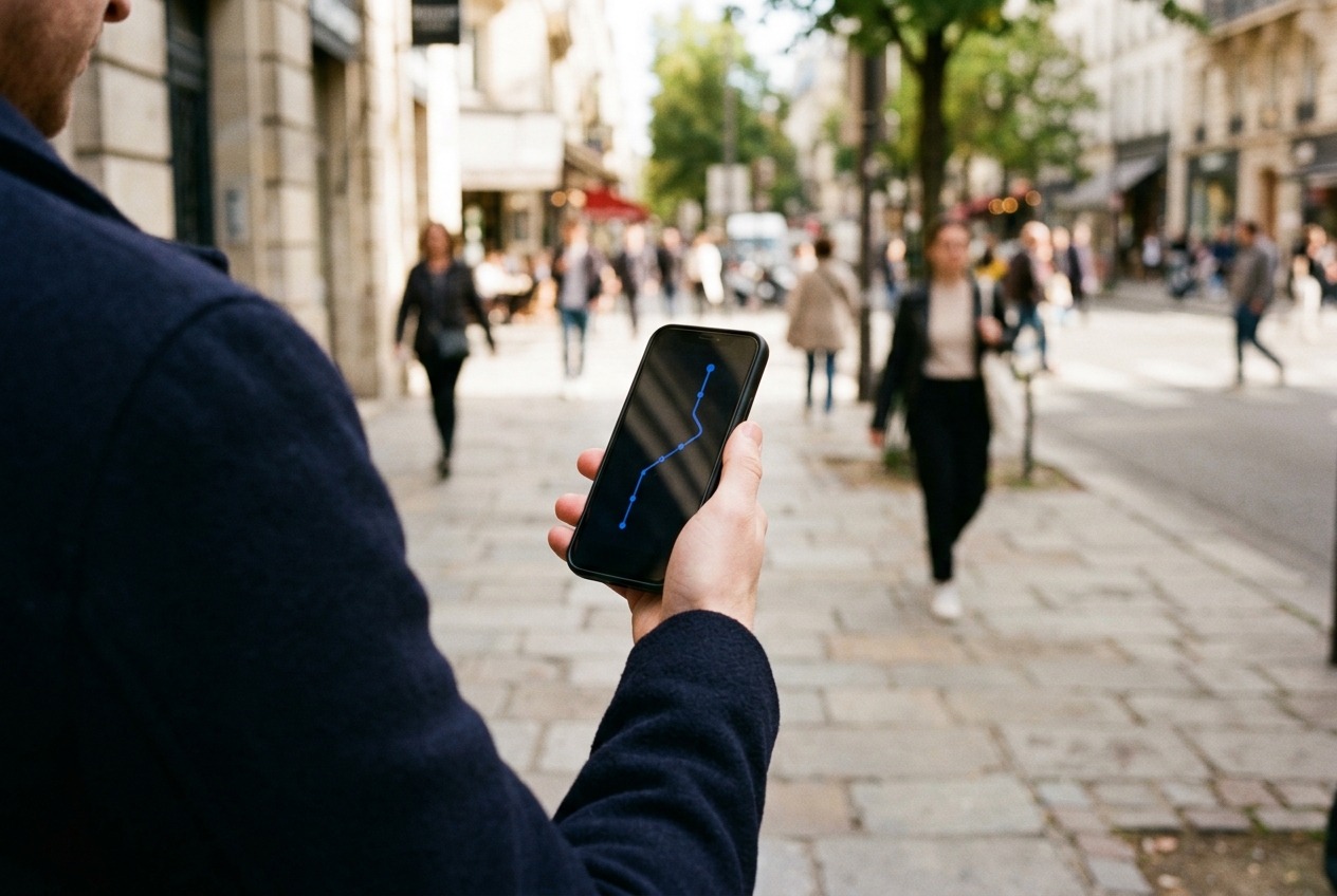
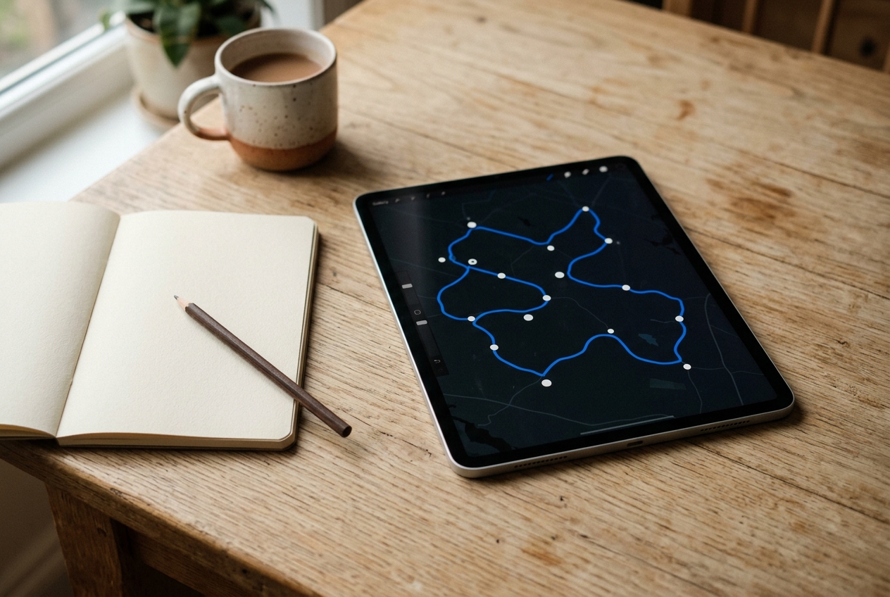
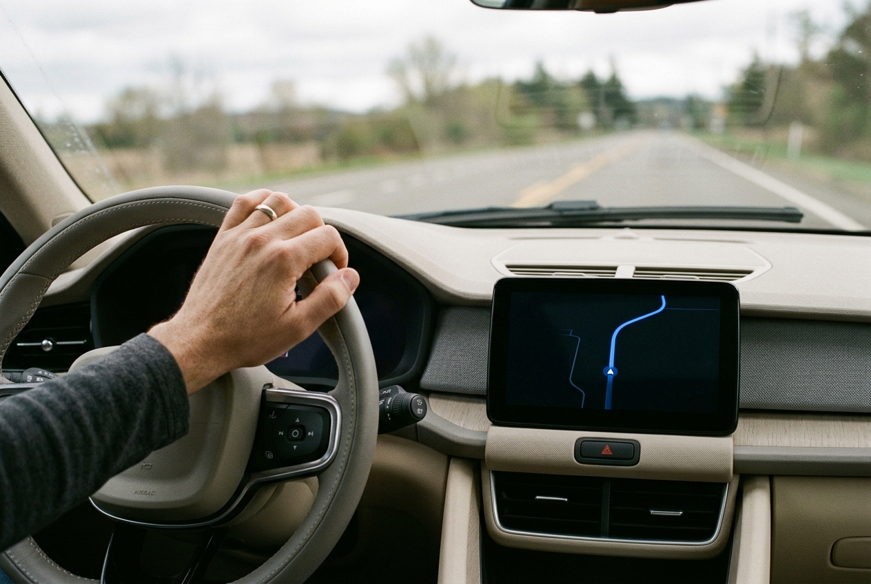
Take a need everyone recognizes: finding your bearings and getting somewhere. A navigation service such as Google Maps serves it in a car, on a phone and on a tablet, and the need is the same in all three cases. What changes is everything surrounding the person who has it. I do not promise that every current version of the service offers exactly the same functions on every device; I use the example to compare scenarios, not to describe a product.
In a car, attention is shared with driving. Google’s design guidance for driving (Android Auto / Android Automotive OS) establishes that driving-related tasks take priority over any other, that information must be readable at a glance — it proposes a maximum of two seconds to read a piece of content and return to the road — and that no operation should require taking both hands off the wheel.2 These are limits of context, not of screen: the same route calls for fewer steps, shorter instructions and voice.
On a phone, during a walk, the hand is occupied, daylight competes with the screen, battery matters and attention is divided with the surroundings: the street, other people, the next crossing. What the interface must achieve is that the next action is recognizable and can be handled with one hand.
The tablet, by contrast, tends to appear when someone is preparing a trip. There is more surface and room for unhurried browsing: comparing alternatives, seeing more context. But it is wise not to assume that every tablet has the same sensors or serves the same purpose as another.
Table 7.2 — The same need in three situations
| Scenario | Interaction conditions | Decisions it raises |
|---|---|---|
| Car in motion | Attention shared with driving, reach of controls and brief reading | Prioritize directions, reduce steps and make use of voice and audio |
| Phone during a walk | Occupied hand, outdoor light, battery and attention to the surroundings | Make browsing and one-handed use easy; make the next action recognizable |
| Tablet when planning a trip | Larger surface and room for unhurried browsing | Compare alternatives and show more context without assuming every tablet has the same sensors |
That is why reducing the difference between these three scenarios to screen inches is a simplification. The device changes the available channels and also the effort that can be asked of the person; at bottom, it changes their acceptance threshold. And the interface is transformed even more when the interaction occupies the whole body.
Part II — From Physical to Digital · Chapter 07 · 03 Body and senses

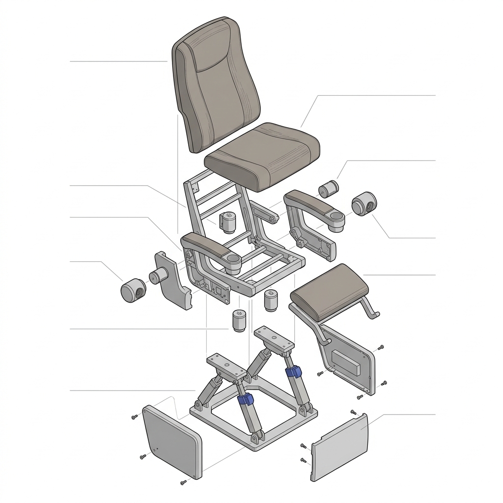
To see this same problem in a physical object, I propose a conceptual multisensory seat for a 4D theater. It is a working example, not a portrait of a commercial installation: it lets us analyze movement, vibration, thermal effects and coupling with sound without attributing this whole configuration to every theater that exists, or assuming that each effect originates inside the seat. Part of the sound, the air or the heat may come from the room.
Taken apart, the seat shows that each part carries a design decision and that each decision has an aspect someone must evaluate.
Table 7.3 — A seat broken down into decisions
| Part or system | Design decision | Aspect to evaluate |
|---|---|---|
| Seat and backrest | Geometry, support and padding | Fit to different bodies and comfort throughout the show |
| Base and actuators | Travel, speed and acceleration | Controlled movement and clear space required |
| Contacts and supports | Position of arms, feet and hands | Stability, access and the possibility of changing posture |
| Vibration and sound | Intensity, duration and synchronization | Clarity of the effect and accumulated sensory load |
| Thermal system, if any | Location, control and exposure time | Contact, regulation and safe conditions of use |
| Covers and joints | Materials, cleaning and access to components | How the experience holds up during operation |
All these variables need specification, testing and acceptance criteria. An intention of immersion does not by itself guarantee an experience that suits everyone: the backrest that supports one body well can leave another without support, a travel one person enjoys can bother another, and a vibration that is clear at the start of the show can turn into accumulated sensory load by the end. Here the idea of tolerance returns. The point is not that the seat works on average, but knowing within which variations it still works and for whom.
But the seat still has to be installed in a room, and there limits appear that the design of the seat alone cannot resolve.
Part II — From Physical to Digital · Chapter 07 · 04 Space and capacity
Suppose the commercial goal is to have a certain number of seats. That number translates into a conversation with the available floor area, the spacing between rows, the motion envelope of each seat, the access routes and the space for maintenance. Accessibility and evacuation have to be considered from the outset and not at the end; the applicable dimensions depend on the project and its location, so I do not propose any here.
A seat that works well as a prototype can take up too much space, or cost too much, once many units are installed. The consequences chain together. Changing the width alters the capacity. Changing the base alters the movement and the maintenance. Reducing the space between rows changes access and the experience of the person seated. Each adjustment that resolves one limit pushes the problem toward another.
It helps to distinguish two volumes that are easily confused. Units manufactured affect the investment in tooling and the cost per part. Seats installed affect the capacity and revenue of the service. Whoever produces the seat thinks about the first; whoever operates the room, about the second; and the design has to speak to both.
Nor is the profitability of a room explained by counting seats. It depends on occupancy, price and operation. More seats do not mean more revenue if the experience forces occupancy down or makes maintenance more expensive.
In digital products, costs are also spread over an expected capacity of use. That capacity must be analyzed per platform and per function.
Part II — From Physical to Digital · Chapter 07 · 05 Economics
Back to the screens: mobile, tablet, television, smartwatch. A function can be technically feasible and still not add enough incremental value to sustain its development, its testing and its maintenance on a given platform. These are two different questions and it pays to ask them separately: what does the hardware allow, and what does the economics justify.
The watch serves for the first: brief interaction, small controls, limited battery and capabilities that vary between models. On television, reading distance, the remote control and the diversity of devices all count. Those are constraints of hardware and context. That a function is not built there for reasons of cost is another kind of constraint, and mixing them leads us to justify with technology what is really an economic decision, or the reverse.
The audience that matters is that of this product and this function on that device, not that of the platform in general. It is not correct to say that watches or televisions always have insufficient critical mass: a small audience can justify a high-value solution, and a large audience may not use the function.
With those assumptions the calculation is a division: 600,000 divided by 120 is 5,000. What matters is what gets counted. It is the users who use the function, not downloads or total users, which neither substitute for effective adoption nor demonstrate that contribution.
When the value of the function is an operating saving, retention or a service obligation, the case is built with that evidence and not with a per-user calculation. And there is a limit no calculation moves: the necessary safety and accessibility are not removed by a popularity calculation.7
Beyond being able to build and sustain the function, we need to understand how much change the person receiving it will accept.
Part II — From Physical to Digital · Chapter 07 · 06 Acceptance
That question has a name in industrial design: MAYA, for Most Advanced Yet Acceptable, a phrase associated with Raymond Loewy. I use it as a guideline to balance novelty and familiarity, not as a mathematical formula. The study by Hekkert, Snelders and van Wieringen examines how typicality and novelty contribute together to aesthetic preference for industrial products.3 Its scope is aesthetic preference; it does not warrant concluding that MAYA by itself predicts adoption, health or financial return.
What I propose is applying it to features. Keep the core benefit of a feature and adapt its complexity to the device, to the task and to what the user can recognize and learn. A smartwatch can offer a brief action and offload extensive setup to the phone, provided the continuity between them is clear and useful. If it is not, the watch merely added a step.
The decision to include, simplify, transfer or discard a feature combines four questions. Is it safe and accessible for the intended use? Does the device sustain it? Does the user understand and accept the interaction? Does the value justify sustaining it? MAYA contributes to the third question, and only to that one. That combination is the method this chapter proposes; it is not an extension attributed to Loewy.
That acceptance also depends on small decisions that repeat, such as a connection chime.
Part II — From Physical to Digital · Chapter 07 · 07 Sound and repetition
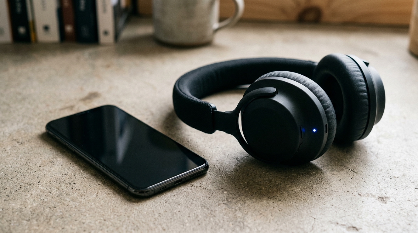
A concrete example of a branded audio signal appears in Marshall’s Major IV headphones. Its support page, explaining how to pair via Bluetooth, notes that the brand’s pairing sound should be heard.4 From that fact, and only from that fact, we can examine the function of recognizable confirmation: it communicates a state (“connected”) and builds identity. I do not extend that behavior to other models, to a wired connection or to other events without verifying it.
The difference matters between an occasional alert and repetition throughout a working day. Hearing a signal once, when unboxing a device, is one thing; hearing it dozens of times a day is another. Intensity, duration, frequency, context and user control are all part of the design decision. Whether a sound pleases or annoys is not a universal constant: it is a response that requires research with diverse users across representative situations.


The same applies to notifications, sounds and vibrations in software applications. Choosing categories, timing, frequency and delivery channels, grouping messages and distinguishing between confirmations, marketing promotions and critical alerts are decisions that distribute effort: either the product absorbs it by filtering and prioritizing, or the user absorbs it by dismissing and silencing. Personalization is, at bottom, the control a user holds over their experience.
That control includes exit routes. Deleting personal data and closing an account belong to the same relationship and demand clear consequences and understandable interactions: anyone deciding to leave should know what is retained, what is purged, and when. It also pays to distinguish between system errors, task recovery and user frustration, because they are not identical: an error corrected in a single step does not weigh the same as one that forces starting over from scratch.
And there is a trap in product metrics. Tracking who abandons, who silences and who continues using the product despite frustration reveals far more than counting aggregate sessions. High frequency of use, by itself, does not demonstrate acceptance: people often continue using what irritates them simply because they have no viable alternative.
In enterprise tools and workplace hardware, the operator may have even less latitude to choose whether to keep using it.
Part II — From Physical to Digital · Chapter 07 · 08 Work and health

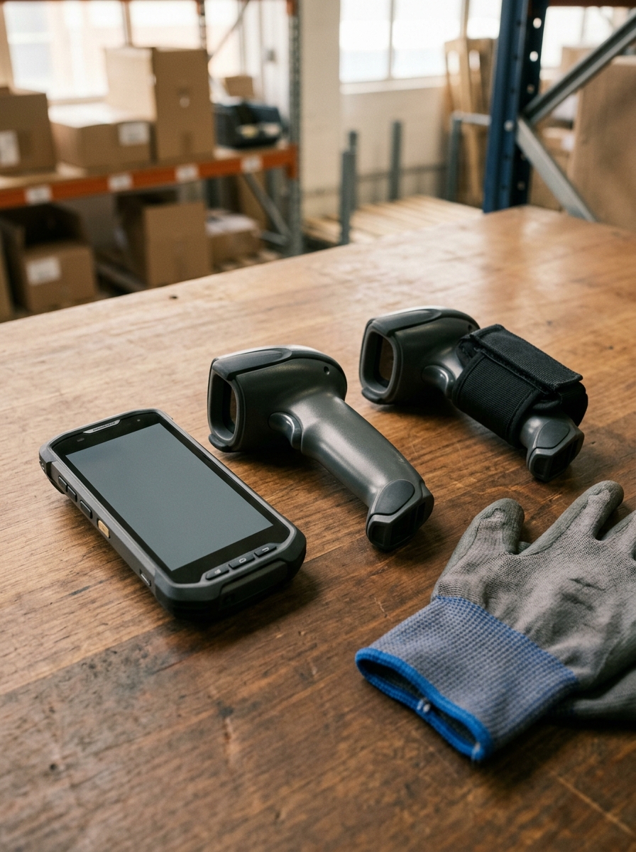
Take an operational scenario. A manufacturing logistics hub equips its floor staff with smartphone-style handheld terminals to scan QR and barcodes: across inbound receiving of raw supplies, outbound shipping of finished inventory, and tracking on the line. The convergence of screen, connectivity and optical scan engine into a single pocketable unit offers real commercial appeal. For any given deployment, one must verify why that specific hardware was chosen; I assume no prior virtue here.
Now compare that phone-style unit with a traditional pistol-grip scanner, evaluated strictly through the work itself rather than product spec sheets: grip balance, center of gravity, trigger actuation, optical scan angle, scan confirmation haptics, compatibility with thick work gloves, and whether the worker must continually refocus on the display. The question to examine is this: by concentrating multiple functions into a consumer-like chassis, do we also alter the physical toll demanded of the operator?
We do not start in the dark. OSHA identifies awkward postures and sustained repetitive motions as primary risk factors for musculoskeletal disorders in warehouse environments.5 That evidence warrants evaluating exposure. It does not prove that every phone-style terminal causes injury, nor that pistol grips are universally superior; the official guidance evaluates factors, not commercial SKUs.
How then should a team evaluate it? Through testing under representative operating conditions, involving both frontline operators and certified ergonomic specialists. Observers record scan cycles, error recovery, sustained grasp duration, wrist postures, hand swaps, repetitive joint strain, and subjective fatigue reported by workers. Crucially, the protocol evaluates alternatives tailored to each flow: ergonomic sleds, holsters, vehicle mounts, or wearable ring scanners that free both hands. One inviolable condition: initial testing must never demand that workers endure physical strain merely to yield research data.
Software architecture plays an equal role. Redundant confirmation modals, barcode decoding delays, dropped wireless packets, or extraneous screen taps prolong the physical cycle and force awkward hold angles. It pays to separate the split-second saved on a single scan from the compounding effect of repeating that motion 2,000 times during a shift: what looks like a minor software quirk in a ten-minute sprint demo becomes an unbearable physical burden across a forty-hour work week.
There is a final organizational imperative. Teams rolling out operational hardware often treat ergonomic risk as something to investigate only after workers file formal injury claims. Responsible engineering demands the opposite posture: we do not need to wait for a disability claim to eliminate an avoidable physical burden.
Part II — From Physical to Digital · Chapter 07 · 09 Method
This entire progression yields an actionable engineering method. I propose maintaining a Map of Limits for every critical interaction. The map documents the task and its environmental context, the observed variable, the explicit acceptance threshold, the empirical evidence available, who validates that criterion, and what remedial action triggers if the threshold is breached. When no validated limit exists, teams must not fabricate one: they document the uncertainty and commission the necessary study.
Table 7.4 — Six layers of the map of limits
| Layer | Tolerance Classification | Example variable | Evidence needed to decide |
|---|---|---|---|
| Material and process | Technical tolerance | Variation in a part or grip response | Specification and manufacturing tests |
| Device and context | Constraint | Actuation, reading and steps during the task | Tests on the intended device and in the intended situation |
| Sensory and cognitive | Acceptance threshold | Alert frequency, errors and recovery | Research with diverse users and representative exposure |
| Space and operation | Constraint & Technical tolerance | Spacing, movement and access | Validation of the installed whole |
| Economics | Constraint | Effective use, cost and incremental value | Scenarios and adoption tracking |
| Health | Acceptance threshold | Postures, force, repetition and duration | Competent ergonomic evaluation and response to reported discomfort |
Recognize the exposure before measuring: which gestures repeat, for how long, in what posture and at what pace.
Measure in representative conditions with diverse bodies and experience, looking at spread and not only average.
Decide the adaptation based on verifiable requirements; never pass the adaptation on to the worker.
Validate real sustained use week after week, evaluating again after changes in flow or pace.
Part II — From Physical to Digital · Chapter 07 · 10 Responsibility
The physical and cognitive health of the person using the system must hold an explicit, non-negotiable place in product requirements and acceptance gates.— Chapter 07 · 10
Back to the toothbrush. The metal bristles made an inadequate decision visible: nobody needs a study to see that they should not touch a gum. In a digital or hybrid product the effort is not so easy to see, because it is spread across alerts, gestures, grips, waits and corrections, each small and all repeated.
The responsibility belongs to the product. It means bringing health and everyday exposure into device selection, into the definition of requirements and into the acceptance of the implementation. A successful demo needs to be complemented with evidence of representative use. And when tests reveal an avoidable load, what is called for is to revisit the object, the flow or the operation before passing on to the person the obligation to adapt.
As product managers, we have to look at what happens after the first interaction. That device will stay in someone’s hand throughout their working day, with the same gestures and the same demands we defined when we implemented it. Chapter 8 follows that trail: it is devoted to what changes when a product scales.